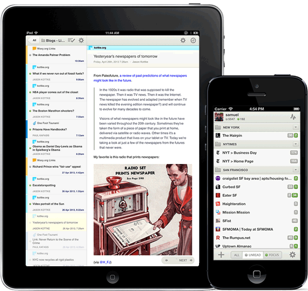
When I wrote this post about RSS readers, a couple of weeks ago, a friend insisted that I should try NewsBlur as well. I always avoided this service, developed by Samuel Clay, mainly because I did not like the homepage (I know, this does not sound serious, but bear with me). The couple of times I actually checked the demo, it looked so messy that it scared me away. But this time I took the time to create a trial account, and after playing with it a couple of days, I subscribed; actually I liked it so much that I decided to pay $36 rather than $24, which is the minimum required.
Since the beginning of the year, I have used in depth three products: Fever, Feed Wrangler, and NewsBlur. The death of Google Reader was actually a good thing for this market: most of the readers available today can do more than Reader ever could, if you take the time to adapt your workflow. They are also better designed. As far as I am concerned, I have decided to stick with NewsBlur, and the more I use the service the more I like it.
What I like in NewsBlur
- A great web app: though not exactly pretty, the web app is very functional and gives you all the information you need while reading; it also supports all the keyboard shortcuts I am used to (including the fact that "v" does open a post in a background tab, while most other apps annoyingly open the tab in the foreground);
- An interesting training engine: I was very skeptical about this, being afraid of some black-box mechanism, hiding or highlighting random stories. It turns out that the engine is solid and very predictable: you can "like" or "dislike" the title of a story (or part of it), its author, tags, or the entire feed. NewsBlur then hides or highlights other stories with the same characteristics. Simple and effective;
- A "text" view: this is simply great. If you subscribe to feeds like Hacker News, this is a must, otherwise for most posts you will just see the title, and will have to open the corresponding links to access the content. In text view, NewsBlur downloads the text and main images from the actual site, and it can be a permanent setting for a particular feed. Again, GREAT;
- A simple and effective way of sharing news and creating a "blurblog", collecting all the stories you share, with your comment (it's basically a "Linked List", something like Daring Fireball). You can also post your comments with a link to your blurblog to Twitter, App.net, and Facebook. Of course all the usual sharing options are also available (email, Pocket, Instapaper, Pinboard, Pinterest, Evernote, etc.);
 Decent iOS apps: unfortunately there are only a few third party apps supporting NewsBlur (actually I found only one, which I haven't even tried because of the poor reviews on the app store). That said, NewsBlur's iOS apps are OK: again, not pretty, but they get the job done. I really hope to see Silvio Rizzi's Reeder, and Oliver Fürniβ's Mr. Reader soon. Unfortunately Oliver told me that he has no plans to include NewsBlur, but who knows, maybe if more people asked…
- The sync is very fast, at least on par with Feed Wrangler and Feedly (I did not take any real measure, this is just a qualitative assessment).
What is missing
What is really missing in NewsBlur at the moment is a good search option; for this reason I still keep my list of feeds updated on Feed Wrangler. Hopefully this will be added soon!
Final thoughts
Might be of interest that NewsBlur is completely open source (source code available on github), so if you don't want to pay for the hosted version, you can host your own. Be warned, this is not for the faint of heart, the technology stack used is quite rich and complex.
It is important to notice that Samuel Clay is behind the entire ecosystem around NewsBlur (web, iOS, and Android apps). This is an impressive work for a single developer, and I do hope that Samuel will keep publishing updates as he is doing now.
NewsBlur is the best RSS reader today, by far.